New Website
As I begin to take content creation more seriously, a properly functioning website that functioned as more than a “link tree” has become more and more important to success strategy
Welcome to the new website, I’m so glad you’re here. In the past, my website has gone through a few forms.
Version 1
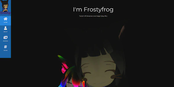
The first version of my website was created on October 7th, 2021. It was a quick and dirty site mad using W3.CSS which contained basic information about who I am with some with some pictures I had taken from VRChat. My socials were at the bottom of the website, acting more like an afterthought than a focus.
Version 2
Version 1 of my website didn’t last long, seeing as that on April 25th, 2022, it got replaced with version 2.
Around this time, I had noticed that many content creators were using linktr.ee to link to all of their social medias. This served as a very convenient way to inform people as to where they may find the creators since every link to every social was in one location.
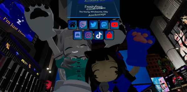
I thought this was a great idea so a followed suite and made my own “linktr.ee”
I think this worked well, but there was much to be desired. Link websites that are similar to linktr.ee face a very big problem. It feels cookie-cutter and quite unprofessional. Don’t get me wrong, they work to promote all your socials. Professionals use them as well. But they don’t “feel” professional.
Link sites also aren’t very flexible. They aren’t designed for creating content. Link sites are designed for hosting links. Additions can be made to support other forms of content, but the core user experience remains centered around links to other websites.
The limitation in usability brings us to the third version of this website.
Version 3
Version 3 of my website is what we have today.
While I was both setting up the Whiskateers website and looking for VTubers to collaborate with, I had been looking at VShojo, Re:Act, hololive Productions, Kawa Entertainment, and 4V Live’s websites for inspiration and guidance on how I should build it. In the end, I just went with a free theme for the Whiskateers website. The research that I had done, however, helped me realize that my simple “linktr.ee” style website was just not good enough compared to what the leading VTuber agencies were doing. I had to change my website.
Changing a website to be something completely different is not a small feat by any means. On October 1st, I began to rebuild my website using Hugo. Up until this point, all previous versions of my website had been coded by hand and existed as individual HTML files, manually edited anytime I needed to make any changes to my website. Now, however, if I want to make a change to the way the website looks, then all I need to do is edit the template and the change will be applied to any page that had that code on it. If I want to make a change to the content, I can edit a markdown file (which uses the same formatting as Discord messages) to quickly and easily make my changes there. This makes my life a whole lot easier and it makes creating content on the web a lot quicker.
While I started working on my website, progress went slow. Real life, my job, my friends and family, and daily responsibilities (such as cooking food, laundry, dishes, cleaning, etc.) all ate at the little amount of time that I had. The layout of the current website, like it’s predecessors V1 and V2, was built using W3.CSS as it’s base to help speed up development. Even so, it still took me until November 19th before I could start work on this very first blog post.
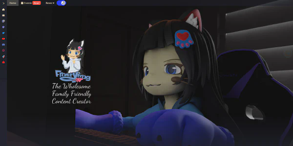
I’ve done my best to make this website look good and I’m trying to make it as accessible to people as possible. Version 3 of my website is the next stage in my content creation journey. The way it is right now has many features that it’s previous versions did not. There is now an events section for showcasing when I am collaborating with other content creators. There’s also a blog section, which you are reading from right this very moment. In the top-right corner, there are links to all of my social media profiles.
This website is far from finished. It will grow. It will change. It will evolve alongside myself and the content that I create for you. Will you join me on this content creation journey? Will you help me to create content that you will enjoy?
Well let’s go then. We’re ready to begin and move forward.
